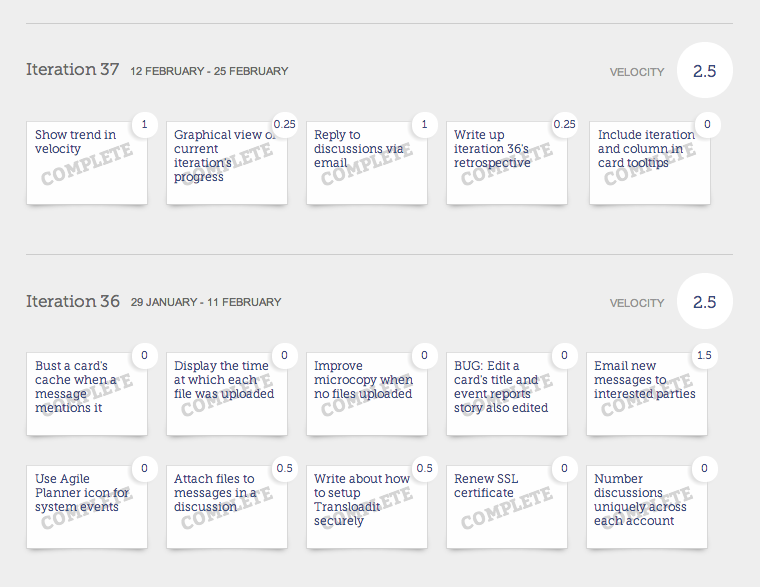
Iteration 37: Big visible charts
I started the iteration by adding some finishing touches to the messaging system. I'm not going to write about it here, as Agile Planner's discussions were covered fully by my last two iteration write-ups (see iteration 35 and iteration 36).
The exciting bits this fortnight have been a couple of charts that help you keep track of how your project is progressing.
A graph of "yesterday's weather"
When gauging how quickly you can work your way through your project's backlog, it's useful to be able to get a good feel for your velocity ("velocity" is the amount of work you can get through in a sprint or iteration).
Since the beginning, Agile Planner has kept track of a team's velocity in each iteration or sprint. You can see the total for each iteration in the big circles at the right of the History page.
"Yesterday's weather" is a simple idea; you're likely to be able to achieve as much work next week as you managed last week. You're likely to have similar interruptions from meetings, unplanned work, while (because you're working at a sustainable pace) the team will work as hard as they did last week, etc.
Naturally, some iterations go wrong (and some go unusually smoothly) so it's more useful to set your expectations for future velocity from what's been achieved over the last two or three iterations. The trend is a more useful indicator than an absolute number.
A graph is a great way to get a feel for that trend. Here's what the new graph looks like in Agile Planner:
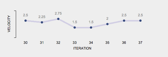
You'll find it on a board's "History" page.
The page will show up to 8 iterations at once, but you can access your entire project history, which means this graph will show you the trend throughout the lifetime of your project.
Summarising iteration progress
While you can get a good feel for how your iteration is progressing by looking at a Kanban-style board (with your story cards arranged in columns, you see at a glance how far the majority of your cards have progressed), not all stories are the same size. A large percentage of the work (and therefore risk) could be locked up in a relatively small number of stories.
For teams that use estimates it's good to know how much estimated work has been completed, or has piled up in one of the columns on your Kanban board.
We've now got a simple bar chart on the "Overview" page showing how the work planned for the current iteration is distributed across the board:
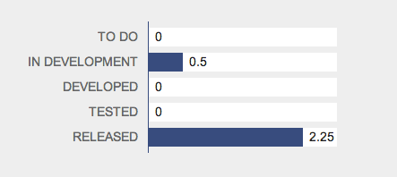
I suspect the experienced Agile managers out there will be thinking "but a burn up/down chart would be even better!" I agree, and it's coming. Think of this as low hanging fruit.
Retrospective
So how did things go? Let's look at the trend in my velocity again. This graph shows the number of points-worth of work I've delivered in my last eight iterations.
Don't worry if the total number of points achieved seems low to you; while most people estimate stories using a 1, 2, 3, 5, ... scale, I'm still using ideal days (it's been working well for me since 2001). You can actually see the individual estimates in the first screenshot in this post.
The numbers are so small as my estimates are consistently optimistic! (What matters estimates isn't how accurate they are, but how consistently inaccurate they are - in other words, the units are arbitrary and its relative sizing that's important.)
As this is the first time I've been able to show you the graph, I'll take a moment to explain what it's telling me.
- Iterations 33 and 34 look particularly poor. If you read their write-ups (iteration 33, iteration 34) you'll see that they included Christmas and New Year. Preparations for Christmas, the toll taken by lots of Christmas parties, and a long weekend over New Year all reduced my time available for work. Next year, being able to see how Christmas 2013 impacted company productivity will help me set expectations, avoid disappointment, and reduce the chance that I'll make any promises I can't keep.
- Iteration 35 was also bit below par. I've already explained what went wrong there...
When I'm deep in the details of some development work, being able to see the trend in velocity helps me remain focussed on the goal; shipping good stuff.
The project history page also reveals one of the things I love about iterative development; when you work for long periods at a sustainable pace you can achieve great things. All you need to do is keep going, but a clear view of just how far you've come provides great motivation to keep going.
But this is supposed to be a retrospective for iteration 37. How did it go?
I'm pleased with it. I scheduled 2.5 points, worked consistently, and it fitted in neatly. Tuck in.